Image courtesy of Buzzfeed
More and more companies are using technology in some way, even if it’s not their main product. Which has led to more clients seeking to communicate the idea of technology with their brands visually. This got me thinking — how has the design language we use to describe technology changed over the years? And where are we headed with it?
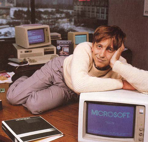
The first wave of visualization was largely about hardware — “Hey, look at this impressive hunk of beige plastic on my desk.” At the time, you actually had to interact with your computer’s innards. Consequently, the design language of circuit boards, electronic pathways, the green glow of the CRT screens, the original default fonts, floppy disks – all became commonplace as signifiers of being “high tech.” There are certainly still electronics in your devices, but as consumers we don’t see them anymore, and therefore many of those first visuals don’t make much sense to millennials, much less younger generations.
At some point, the form language of those early computers largely coalesced. Now that everyone’s computer looked kinda sorta the same (except for those candy-colored iMacs) the differentiator became software instead of hardware. Now, we get into visuals and signifiers like grids (think Tron), zeroes and ones, pixels and 8-bit design. The screen becomes the more important thing because it was essentially the software made visible to the consumer. This kind of imagery has today become the new “retro tech” for millennials and those who followed them. Urban Outfitters is selling Tamagotchis and Atari hats.
Today, your phone and my phone are very probably both a thin rectangle with rounded corners. We don’t care how that device works, just that it does work. Our internet connection has become more like our water or electric utilities . We don’t even think about it unless there’s a problem. That brings us to the most recent wave in visualizing tech — the user experience. Think about products like the Amazon Echo and Dot. They’re very friendly and unassuming items. They’re not meant to stand out as an icon on your desk. They’re meant to blend into your lifestyle seamlessly. These round shapes covered in fabric are about 180˚ from the hard lines and cold lights of original computer form language. Or consider this example of a home hub — it’s so minimal, you might not even know it’s technology.
So, what does that mean for visualizing technology now? Today’s design language has more to do with the user than the actual underlying electronics. How will someone interact with it? What does it do for them? How about haptics — what should technology feel like if the consumer has to touch it? Google is great at bucking the “techy that’s trying too hard” trend. It’s probably one of the most sophisticated technology companies in the world, but it uses simple, primary colors, clean flat design and white space to convey its brand in an approachable but still professional way.
As for the future, industrial designers are still struggling with what robots should look like in a way that will make us actually want to interact with them. Most end up just being creepy. And it’s hard for me to hear about AI without thinking immediately of Skynet from the Terminator movies. That, of course, was a futuristic fantasy of AI. How we visualize AI will begin to morph and change dramatically as fantasy morphs into reality. Please, please, please, don’t be creepy.
——-
K. Nicole Stowe | Creative Director — Design


