
I recently had the opportunity to ask Laurie Pressman, Vice-President, Pantone Color Institute, some of my burning color questions.
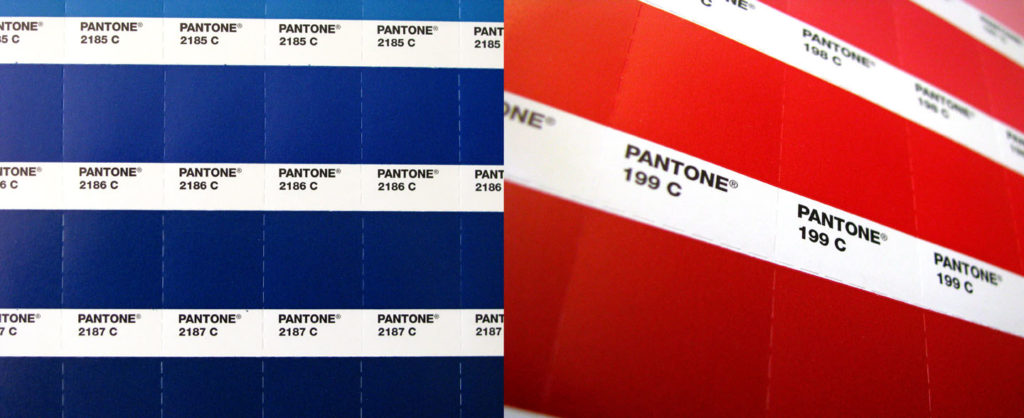
How have you seen color play into the upcoming election? Both candidates seem to be leaning more heavily toward dark blue vs. red.
With the media spotlight so intense and so much scrutiny paid, color always plays a role in politics. Candidates know this and use color to communicate a message about who they are. While consumer sentiment appears to be at a five-year high, there is still so much financial turmoil and global unrest. As such, colors worn need to convey a level of seriousness, stability and honesty. The safe, secure dark blue conveys not only integrity, and law and order, but also represents constancy, achievement and, most importantly, communicates the message of leadership the country is craving.
Do you feel that certain colors are historical, or is it the way we combine colors that creates a historical reference?
Certain colors can be historical on their own and this, of course, can vary by culture. The red color of the Chinese flag and the color of the home where our president lives in the U.S., the White House, are clearly colors that are historical on their own. The way we combine colors can also create historical references. A good example are flag colors, which will always point to a historical reference for any country.
Here’s a personal pet peeve of mine – pink still dominates as a color that manufacturers use to create women’s products (pink hammers and the like). Do you see any end to that?
The pinks do continue to rise in popularity. Vibrant pinks capture some of the essence of red; the hot pinks radiate high energy, exerting a youthful and sensual force; and lighter pinks and roses carry the connotation of things that are sweet and innocent. Through the years, pink has traditionally been associated with women’s products. Called the color of the decade in the 1950s, ads for pink were targeted to women, advising them to “think pink and look beautiful.” Vogue introduced “fashion’s smartest cigarette” in pink and Chrysler Corporation’s Dodge division introduced Dodge La Femme in pink in an attempt to cater to what they were calling “the lady of the house” so they could gain a foothold in the developing car market for women. It is because of how pink was originally marketed that it became so strongly associated with femininity and why breast cancer awareness chose the color pink for the ribbon that is their symbol. Attaching a particular color family to a social issue prolongs the importance of a color family in the popular culture and acts to reinforce a color’s association. So while male consumers have started to see the appeal of pink and this color has become more transgender, it is still very closely linked to a more feminine feel, something manufacturers certainly help to capitalize on and perpetuate.
I bought the Pantone Tangerine Tango (color of the year 2012) nail polish set at Sephora. Does Pantone plan to create more products like that?
The relationship between Pantone and Sephora is ongoing. We continue to introduce mini-collections throughout the year. We will be introducing a new one for holiday this fall, and then again a line of color cosmetics to celebrate our introduction of the Pantone 2013 color of the year.
Speaking of color of the year, how is that decision made?
We will be introducing our Pantone 2013 color of the year in December. As we typically do when we make this color selection, we look at the big social and cultural trends that are impacting the world including lifestyles, playstyles, the environment, technology, media, social influences and the economy.
We additionally talk with a broad cross section of designers from around the world who are involved in many different design disciplines including fashion, home furnishings, industrial and print/packaging, multi-media, youth culture, and industrial design to find out the colors they think will be important in their businesses for the upcoming year. And of course, the art world also plays a role, and more and more we see the emergence of street art coming into play.
While I would love to share more at this time, this information is very closely guarded until our release date. However, as our color of the year is more a reflection of the color zeitgeist as opposed to a color forecast, suffice it to say this will be a color which will resonate with both the worldwide design community as well as the global consumer. As Leatrice Eiseman, executive director of the Pantone Color Institute reminds us, we need to ensure each year that our chosen shade is one that, at least symbolically, satisfies people’s aspirations and encourages their needs and hopes.
How do you retire colors? Or do you?
Our colors are considered standards and, as such, the only reason we would ever have for retiring a color would be because it can no longer be produced in a manner that is environmentally safe in the real world, due to changes in dyestuff regulations.
See more articles from Laurie at the Pantone blog.
Nicole Stowe is Director of Visual Brand Identity at The Ramey Agency.