Very often in brand discovery sessions, we start with words. We talk about words that might describe the brand, we talk about words that describe what is going well and words that describe problems or issues. We talk about words competitors use. We use words to describe what customers want. Words are super important. But at some point I like to bring out visuals for discussion. This does a couple things: 1. It forces people to use a slightly different part of their brain to answer what may be some of the same questions already asked. And you’ll get a different answer. Many company leaders are great at their talking points, and this forces them out of that zone for a bit. 2. It taps into a more emotional answer. And that answer is often more insightful in creating signifiers for design. Why is that important?
“…studies show 85-95% of buying decisions are driven by emotions, not analytical considerations like functionality.” – Psychology Today
Whether you like tapping into your feelings or not, your consumer is using their feelings and emotions to choose one brand over another.
How does it work to interpret words into visuals that evoke emotions? I like to use the concept of Signifier/Signified. Now, this is a fancy pair of words from semiotics, typically used to talk about linguistics, but nobody ever told me I couldn’t apply this to design. The simple example I like is smoke and fire. If you see smoke (the signifier) you can guess that somewhere there is fire (the signified) even if you can’t directly see it. Designers use elements like color, font, imagery, and shape as signifiers to signify attributes or emotions that help communicate to consumers what a brand stands for.
We’ll take color for example. How do these four shades of blue feel different from one another? What would you associate with each color? They’re all blue. Designers make generalizations about particular attributes that people tend to associate with different colors. This can vary by culture and personal experience. But we take the general consensus of the group we’re communicating with into account. This is why you may not personally like orange, but it might be the best communicator of energy, fire, vibrancy, sunshine, etc. to the larger group of consumers.
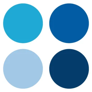
Blues in general tend to signify security, a sense of peace or calm, trust and stability. The darkest navy may remind you of a business suit. The lower left could be a blue sky. The brighter blue at the top left has more energy – it might feel younger. Or you may see a beautiful ocean color. The top right blue might feel classic or remind you of your bank. In just a small subset of blues we have lots of different feelings that we can signify depending on what’s appropriate.
Here is another example of how design uses feelings to interpret visuals. Look at these two shapes and decide which one is called bouba and which one is called kiki.
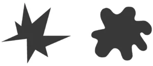
Most people, even on a worldwide scale, will associate the more rounded shape with bouba and the spiky shape with kiki. This bouba/kiki effect shows an association between speech sounds and visual shapes. And we can take that a step further – shapes can be signifiers for feelings. Designers can use rounded shapes to signify concepts like harmony or flow or nature, and spiky shapes to signify roughness or immediacy or something more acute.
Any of the elements in a designer’s toolbox can be used individually or in combination to create signifiers appropriate to your brand and communicate on a emotional level.
_________________
For more writing about design process, check out Vis Communication.
Written by