Here at Ramey, you may have noticed we have a bit of a niche footing in the world of luxury and high-end brands. You can tell that luxury brands not only look different but also feel different than other industries, but maybe you can’t quite put your finger on why that is. I’m here to share some of the cues that high-end brands take in order to convey their worth in the premium markets.
Negative Space / White Space
Arguably the first thing many people notice, and are often a little wary of, is the use of white space (professionally referred to as negative space). Whereas a typical retail ad crams as many features, promos, razzle, and dazzle as possible into one ad, luxury brands present themselves in the opposite manner.
White space in and of itself becomes a luxury. It gives the ad room to breath and allows the eye (and heart) to appreciate style and tone. Messaging is smart but minimal, without a price tag anywhere in sight. Because we are assailed with oversaturated messaging in almost every platform and screen, this striking lack of visual information becomes more impactful. While retail brands cast a wide net teeming with buzz words, high-end brands forgo the net altogether. They know their audience and speak to them directly and unapologetically. This drives genuine loyalty and eager anticipation for what’s next. You don’t need to “make the logo bigger” when they already know your brand by heart.

Typography
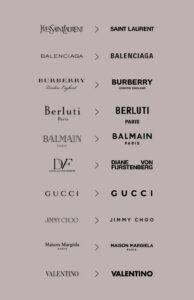
The next immediate departure from average branding you may pick up on is the use of typography in luxury brands. Most brands tend to reach for the usual sans-serif variants of Helvetica or Arial. But in the world of our more affluent friends such as Louis Vuitton, Rolex, and Tiffany & Co, there is a focus on more eye-catching but not always practical typography.
These brands wield type as a design element to express distinct personality. In their hands, type doesn’t just convey words, it telegraphs the brand’s essence. Type may be expressive to the point of almost becoming abstract by way of bold, high-contrast line weight and playing with proportions that subvert the norm. These brands have the confidence to be evocative, knowing their customers appreciate the artistry more than an advertisement.
In recent years, many legacy luxury brands experimented with cleaner, sans-serif updates that perhaps felt more digitally-native (Yves Saint Laurent, Burberry, Gucci, Jimmy Choo, to name a few). But now the pendulum is swinging back to their more distinctly ornate aesthetics.
Limited Color Palette
Have you ever noticed that many of these luxury brand commercials are quite selective with their use of color? That’s yet another entirely intentional approach to keep things clean, elevated, and consistent. There is no need for excessive embellishment in good story telling – and at it’s heart, a strong luxury brand is a story. They are not simply “moving product.” They are building an exclusive fan-base of people who “get it”.
If and when color is used, it is limited, tasteful, and the brand palette is religiously adhered to in order to establish a signature style to their identity. Tiffany & Co. have their defining shade of aqua, Chanel essentially owns the market on black, and it’s hard to mistake orange for anything other than Hermés.

Key Takeaways
Crafting and maintaining a top-tier luxury brand is not for the faint of heart. It simultaneously requires inspired experimentation and bold choices. Most importantly, it requires discipline in staying true to the voice you have established. You must be willing to expose who you are in order to cut through the clutter. I get it, negative space can be intimidating. With barely anything on the page, it can seem like it’s hardly designed at all. But on the contrary, it means that every single element that remains was placed with absolute intent.
The views and opinions expressed are solely those of the author and do not reflect those of the Ramey Agency or its affiliates and are shared for educational and entertainment purposes only.

Written by